Minimalist Design: It’s Not Boring
I never thought I’d do it. I love layers of antiques and rich moody colors and abundant textures and patterns. Nevertheless, clients have sought me out and pushed me beyond my comfort zone, and for that I’m eternally grateful. I’ve been fortunate to work with people who trust my inherent creativity and my capability to deliver a minimalist design, and so far: Fireworks.
I’ve come to understand some paramount components to minimalist design.
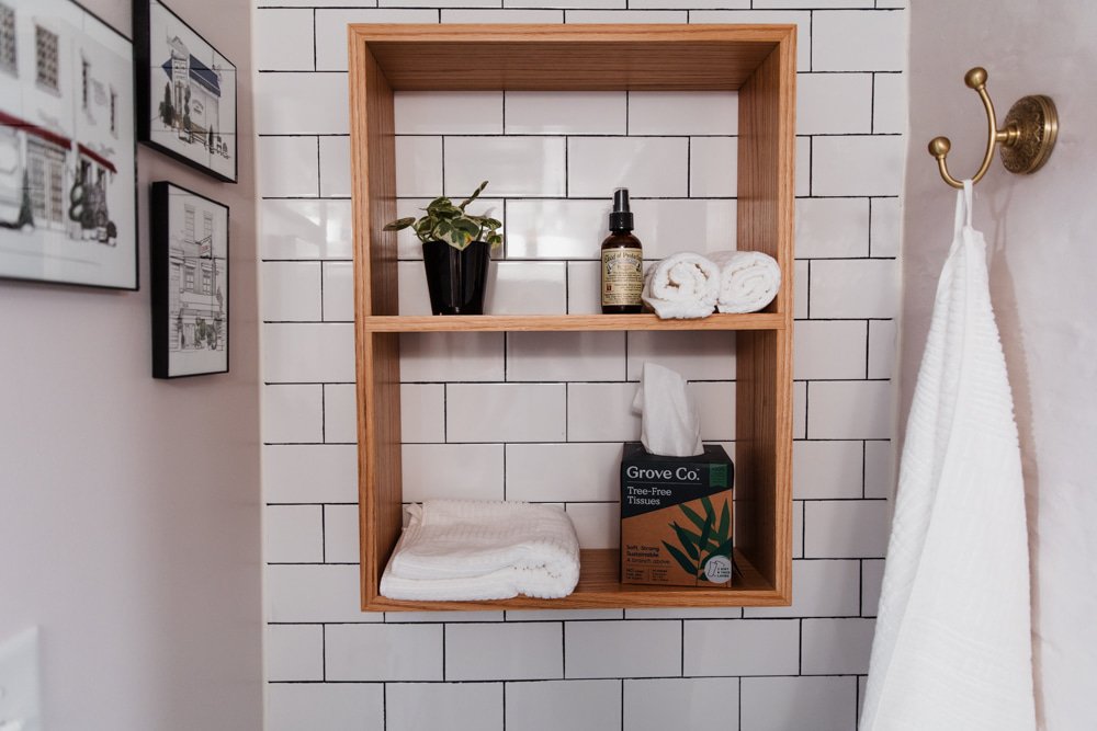
Use a neutral palette. Wood, black, white, and brass are *chef’s kiss*.
Lots of plants still.
There is an abundance of white paint in various tints, tones, and shades. Whites with pink undertones are velvety and cozy. Check out Sherwin Williams Gorgeous White.
Lighting is key. I like a warmer bulb, and more floor and table lamps to avoid a sterile, harsh environment.
Texture remains! Leather, brass, boucle, velvet, fur, feathers, wood, wool, Italian plaster, marble. I’m in love.
Not a professional photo clearly. Those are African juju hats on the wall. Project almost complete.
Remember there’s a place and a client and a mood for every design type; there is no right or wrong. What continues to reign supreme is that your space feels like you.


